.png)
UTM Timetable Planner
UX Design / User Research / Usability Testing
Role: Co-UX Designer


Duration: 4 Months
Tools Used: Figma, Adobe Photoshop, Microsoft Excel, Mural
OVERVIEW
The University of Toronto Mississauga is a highly acclaimed public University that specializes in both research and University level education.
Behind the University's accolades are the students who every year face the stressful period of planning and choosing their courses to best match their preferred educational path and lifestyle. This is where the UTM Timetable Planner comes into play in assisting students in their course planning process. The tool includes functions such as searching for courses, their associated times and days, and creating mock timetables with the desired courses.
Although, my team has identified notable pain points from our own personal experience as students using the timetable planner. These pain points include excessive scrolling when browsing course lists and the hassle of going back and forth between the course list page and the timetable page leading to excessive clicking.
THE CHALLENGE
To experimentally redesign the UTM Timetable Planner, offering two different prototypes that demonstrate new ways of finding and adding a course while effectively alleviating major pain points from the previous version.
THE DESIGN PROCESS
After identifying the project's problems and goals, the design process was defined to outline the stages required to meet project requirements. This process features a loop from Design to Iterate as this part of the process repeats multiple times towards the final prototype iteration.
OBSERVE
IDEATE
DESIGN
TEST
ITERATE
IDEATE
IDENTIFYING PAIN POINTS
We first engaged in a think-aloud session amongst ourselves to identify common pain points and usability fails in our experience with the current website.
A major pain point that we found was that navigating through the website required excessive amounts of scrolling as users had to go back and forth between selecting a course and then referring back to their timetable. Another frustration is that users have to manually select each course and section/time of lecture while conflicts are not readily indicated.
EARLY IDEATION
We engaged in doing the 10 + 10 design sketch exercise where we first make 10 rough sketches of new designs. We then regroup and share our ideas, choosing one sketch as the starting point for the next round.
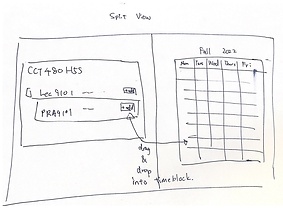
These sketches focus on alleviating the major pain points of excessive scrolling and making the action finding and selecting a course more seamless. In turn, we chose the design with the hexagonal layout for the course list. This component goes beside the timetable on the left. In the second round, we chose the sketch that had the split screen layout where the timetable takes up half of the screen and the course list takes up the other.


USER FLOW
The UTM Timetable planner has many functions so there are many users flows to consider. We were required to focus on one user-flow given the limitations of the project. The user flow that we chose to focus on is the process of searching for and adding a course to the timetable.
We created this user flow to better understand the process users will be going through.
START
Use Quick Search
Choose session, year of study, and program area
Click Search
Select Course Hexagon
YES
Add another course?
Desired course displays on timetable
Click "Add to Plan" Button of desired course slot
NO
END
LO-FI PROTOTYPE
The Lo-fi prototype puts our design choices from our 10+10 design sketch exercise together and is used in the Guerilla Testing session.


UPDATES
-
Prototype features a quick search bar found at the top left.
-
Related courses are then displayed in a honeycomb format consisting of five columns
-
The right half of the page has both fall and winter timetables that eventually get filled up with selected courses
-
Users can remove courses
-
Courses that are conflicting with one another are coloured in red signifying that one must be removed.
PROTOTYPE AFTER GUERILLA TESTING
Results and feedback gained from Guerilla Testing led to the following iterative updates.


UPDATES & INSIGHTS
-
Prototype displays only one semester timetable at a time to better utilize the space. We found that users had a hard time reading the timetables and therefore had to zoom in the timetable in order to read course codes.
-
Columns of hexagons have been reduced from 5 to 3 for better visibility of course code text as users had to zoom in order to read the text of the previous version.
-
Courses are now colour coded in accordance to their semester. Orange represents fall while blue represents winter courses.
-
Users are able to see different lecture times, dates, assigned professors, amount students enrolled, and course descriptions after they have selected a course hexagon.
BENCHMARK TESTING
For this stage of testing, we asked users to perform a set of tasks that make up the process of searching and adding a course. The results were benchmarked via recording the number of clicks and errors a user takes for a given task and a likert scale, measuring their level of satisfaction per task.
Updates to the prototype were made based on the results and user feedback we received.
PROTOTYPE AFTER BENCHMARK TESTING


UPDATES & INSIGHTS
-
Added a hover state to all hexagonal course buttons to signify that the button is clickable.
-
Users can now scroll down and find more courses.
-
Added a blurred background that transitions through different images of UTM buildings. This was done because the users thought that the previous version looked to static and paper-like rather than a moveable interface.
ALTERNATIVE DESIGN
We were also required to develop an alternative redesign for finding and adding a course.
The alternative design replaces the hexagonal panels with playing-cards-inspired panels for the course buttons. We chose this direction for our Alternative Design based on the data we got from our benchmark testing sessions as multiple users struggled in scanning through the first design’s courses in a zig-zag pattern that the hexagonal layout encourages. Thus, the Alternative Design alleviates this struggle by offering a more traditional layout that encourages the familiar up and down left and right mode of scanning.


A/B TESTING
A/B Testing was done with 12 users to determine which of the two designs was most effective in mitigating the pain points and was considered more usable and satisfying for the user.
With the Independent variables being the two prototypes, the determiner of what is the more usable prototype, in other words, which prototype mitigates the pain points most effectively, depended on the data we received from the following dependent variables:
When doing tasks on the prototype
-
Time taken to find the course
-
Number of errors/clicks
After tasks are completed
-
User input on the System Usability Survey (SUS) Scale where users are asked to rate different aspects of a prototype
-
Overall satisfaction rate with their experience with both prototypes.
RESULTS ANALYSIS
The A/B testing results showed that The Alternative Design had a higher user satisfaction rate average than the first design with the user satisfaction rate. Although, the majority of users subjectively prefer the UI design of the first design (hexagonal course panels) to the Alternative Design (card course panels).
IMPACT
92%
1 Click
7.6s
User Satisfaction Rate of 92%
All users only needed 1 click in the process of adding a course to the timetable
Users took an average of 7.6 seconds to search for a course
FINAL PROTOTYPES
These are the final interactive prototypes. These can expanded to full screen to match the actual size of the website.